Color Guide
- Intro
- Digital Prints
- Physical Prints
Welcome to our Color Guide! Our products are printed in a timeless beige color, designed to complement any space with warmth and elegance. This page is here to help you visualize how this versatile shade will look in your home, making it easier to create a harmonious and inviting atmosphere. This page will focus on the general beige color that you see on 95% of our prints.
To make it easy we will split this page into two sections: Digital Prints and Physical Prints (Posters, Frames, Canvases).
Keep in mind that your screen, whether desktop monitor or phone, may have a warm or 'night shift' setting on which diminishes blue light - this setting can make the colors/prints on our website appear deeper-beige or even beige-orangish, so make sure to turn that setting off while viewing the color guide and products.
Digital Prints
Our Digital Prints are JPEG files delivered via email in RGB and CMYK color formats. For anyone who has printed images before, you probably know that every piece of the process can affect the color and quality - from paper used, ink used, file format, humidity, printer type, printer settings, etc.
- RGB - Color values for online viewing
- CMYK - Color values for printing
- So which do you use? Try CMYK first on printing websites, but if that doesn't work then try RGB as some websites accept RGB only and turn the files into CMYK format themselves.
Delightfully, with our included PDF instructions over 75,000 customers have printed our files successfully! Nonetheless, we want you to know what color to expect. The file backgrounds will appear in a grayish-beige color on screen and we have a texture on the background as well.

Once printed, customers have seen the print come out anywhere from light gray to perfect beige. See some variety in the image below and view a larger gallery of customer prints here. (While viewing the gallery, keep in mind that we do offer some 8x10s in straight gray, which are included in the gallery.)

Again, many variables affect the outcome. We have found that the Staples "Poster" option for printing our digital files has resulted in a perfect warm beige color. However customers have also printed through Mixtiles, SimplyFramed, Mpix, Shutterfly, local print shops, and at home!
If you have trouble achieving the beige color you want, you can edit the files through Photoshop or a free photoshop-like editor such as www.photopea.com. (Reminder even if you edit, you may not share our files with anyone - Copyright Policy.)
To increase the file saturation try the steps below for RGB files.
Go to www.photopea.com on a desktop browser.
- Click File/Open/Select File
- Click Image/Mode/ make sure the correct option RGB or CMYK is checked
- Click Image/Adjustments/Hue Saturation...
- Increase the Saturation by either 20, 30, or 40
- Click File/Export As/JPG (change 'px' to 'in') Click Save!
For CMYK files: In my opinion it would be easiest for you to upload the RGB file, edit it to your liking, then change the Image/Mode/ to CMYK and then export as a JPG. This is because CMYK does not view well on screens - which are RGB.
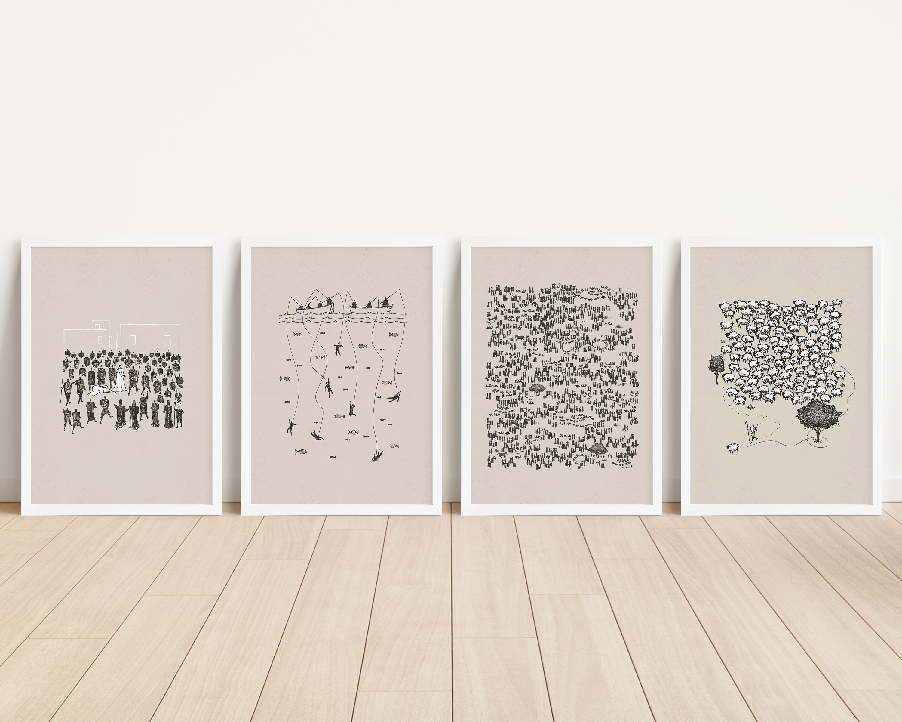
Physical Prints (Posters, Frames, Canvases)
We worked very hard to get the timeless versatile beige color just right on our physical products through a lengthy trial period of iterations. The Poster, Frame, and Canvas options provide ease and simplicity to our customers who prefer to leave printing to the professionals.
- The poster and framed prints have a textured background as they are from the same files.
- The canvas prints do not have a textured background.
The three options are laid next to each other below, with a black frame and white frame. The banana, apple, and white cardstock will help bring balance to the way your eyes view the color. You will notice the canvas appears a tad lighter - this is due to the absence of a textured background.

White-framed poster against a gray wall:

Canvas on carpet in direct sunlight and indirect sunlight:

Poster in indirect sunlight next to color swatches:

Poster in direct sunlight next to color swatches:

We hope this information brought greater clarity to those wondering how our BibleSketches collection will look in their home!